Overview
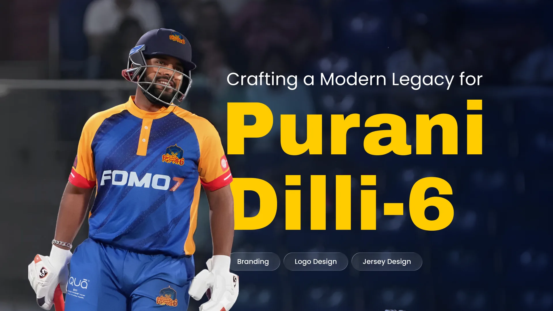
Purani Dilli 6 is a T20 cricket franchise in the Adani Delhi Premier League. I created the team’s complete brand identity from the ground up. The challenge was a brand that felt deeply rooted in the history of Old Delhi and aggressively modern, able to stand out in a competitive league.
- Responsibilities
Strategy to guidelines
Brand strategy, logo design, the visual identity system (colour and typography) and brand application guidelines.
- Deliverables
A full system
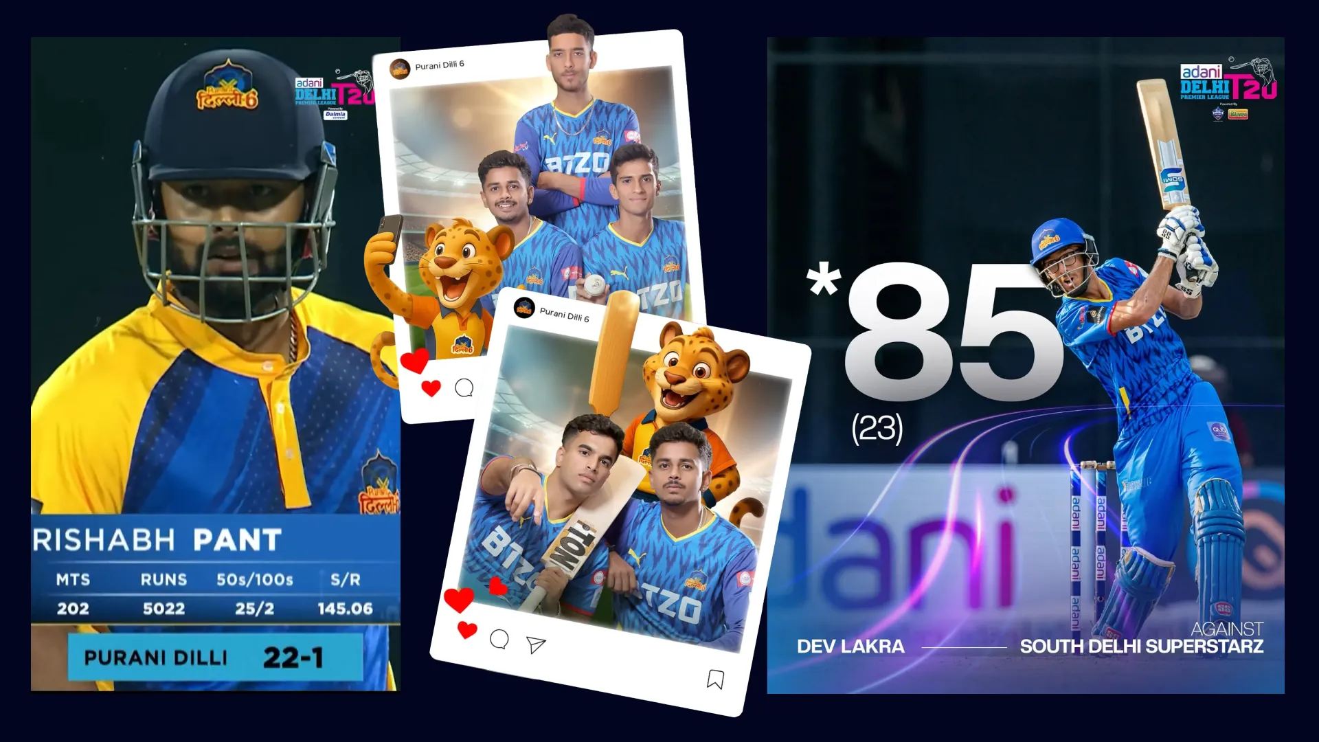
Logo, jersey design, colour and type, a mascot and templates for match-day and social media.
The mandate
The owners wanted an identity that bridged two worlds: the historic, cultural legacy of Old Delhi and the punchy, confident swagger of modern T20 cricket. It had to feel authentic and timeless, yet bold and intimidating, a brand both long-time residents of Old Delhi and a new generation of fans could rally behind.
Creative strategy
The process centred on finding one powerful symbol that could anchor this dual identity.
1. Anchoring the brand in history
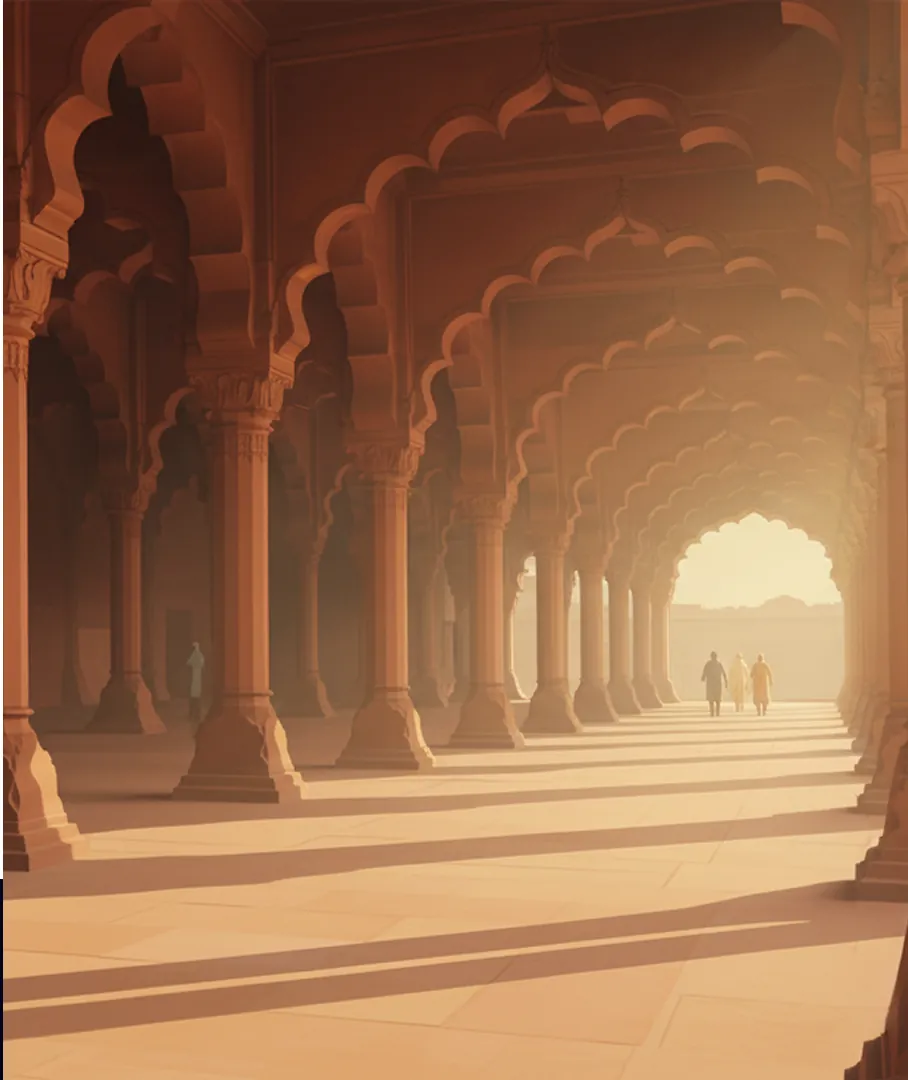
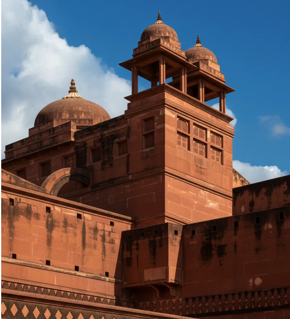
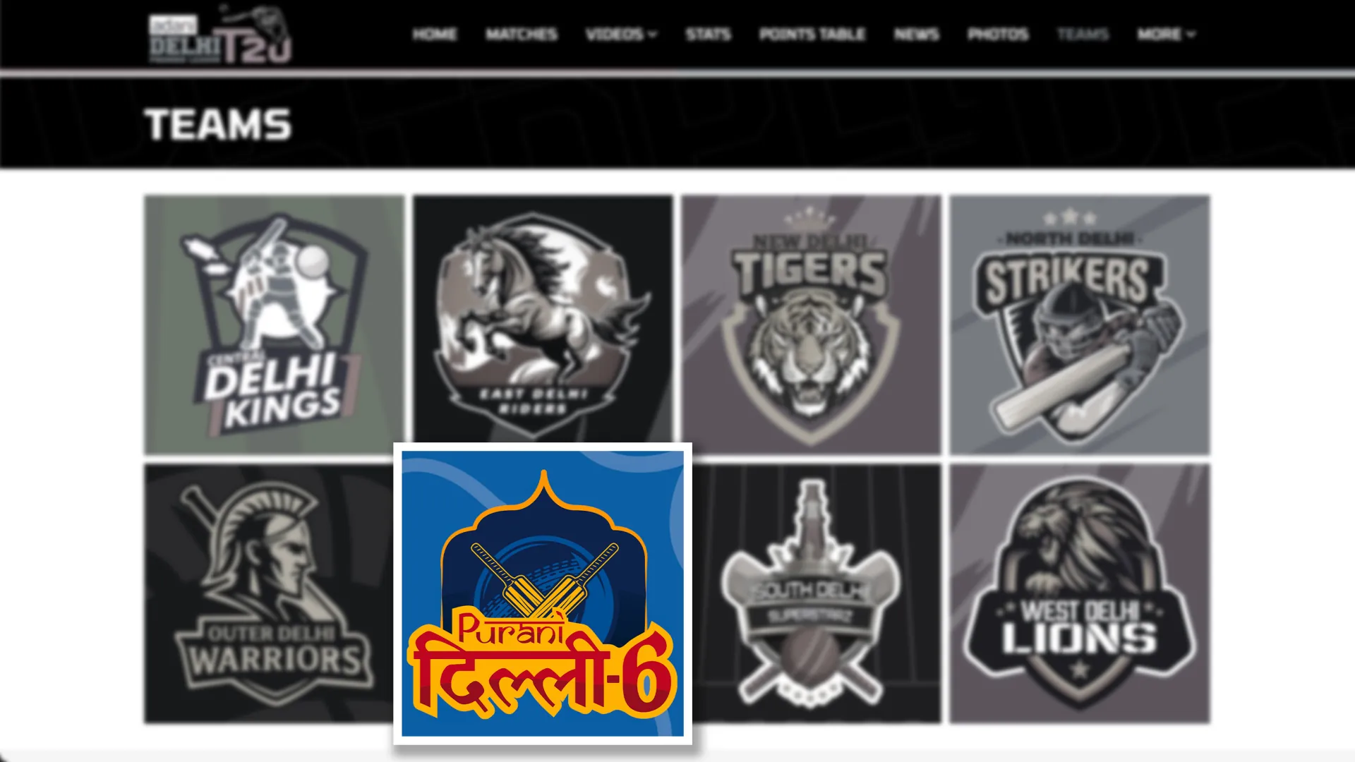
“Purani Dilli” (Old Delhi) was the natural starting point. I explored several landmarks, and the Red Fort (Lal Qila) quickly emerged as the strongest. Its famous archways became the foundational shape of the logo: a solid, grand base that stays powerful and recognisable even when simplified.
2. Forging a modern icon
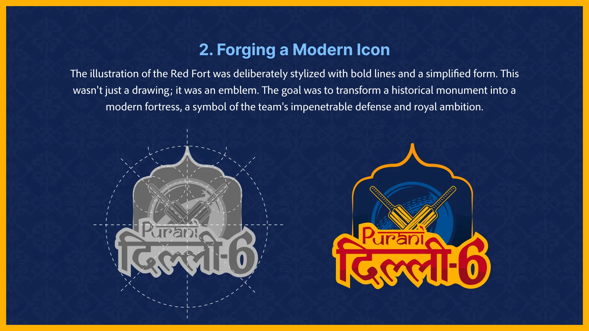
The Red Fort illustration is deliberately stylised with bold lines and simplified forms. It isn’t just a drawing, it’s an emblem: a historic monument turned into a modern fortress that signals the team’s strong defence and royal ambition.
3. Authentic typography
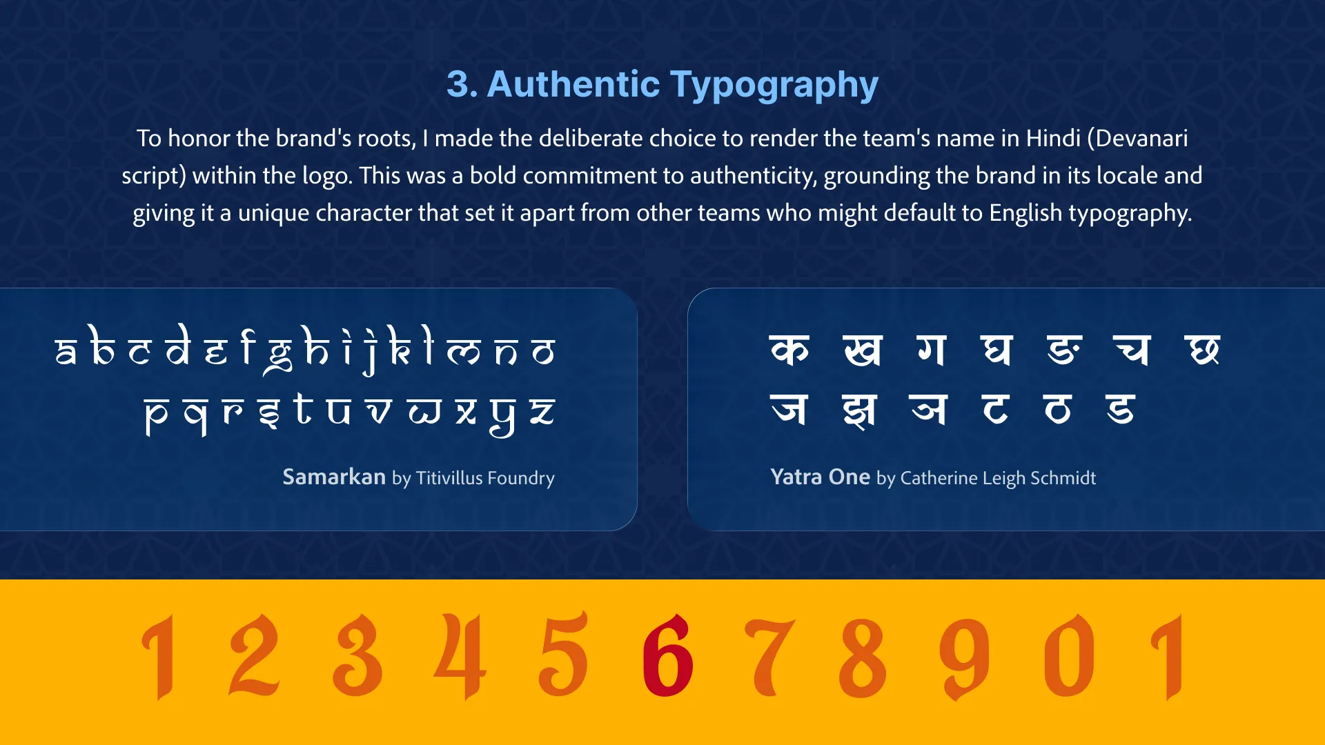
The team’s name is set in Hindi (Devanagari) inside the logo. It’s a deliberate commitment to authenticity that grounds the brand in its place and sets it apart from teams that default to English type.
The visual identity system
A brand is more than a logo. The supporting system is versatile and vibrant, ready for everything from player jerseys to digital media. The primary colours, a deep royal blue and a striking red, were chosen for symbolic and practical reasons: together they evoke the “Bleed Blue” passion of India’s national team and give very high contrast, so the logo stays bold on jerseys, in print and on screen.
- Royal bluePrimary
- MidnightDepth and backgrounds
- Fort redPrimary
- MarigoldHighlights
The brand in use
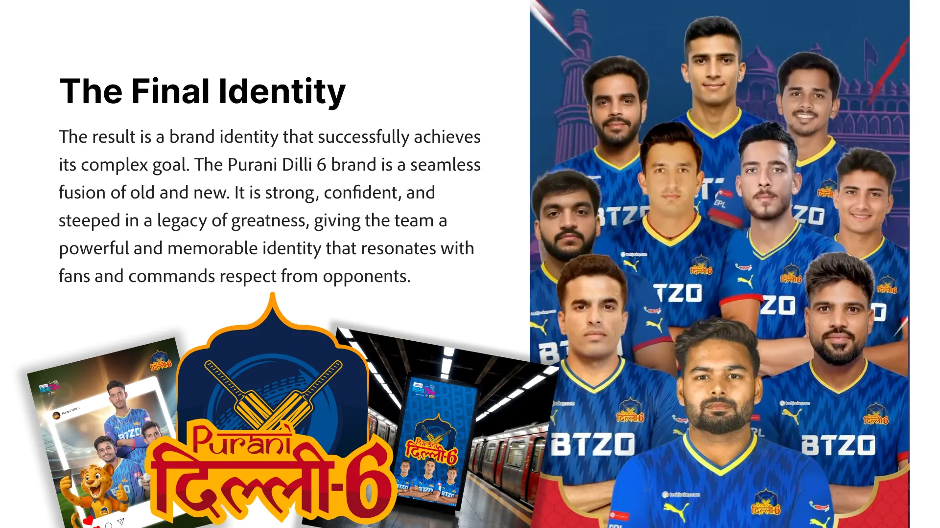
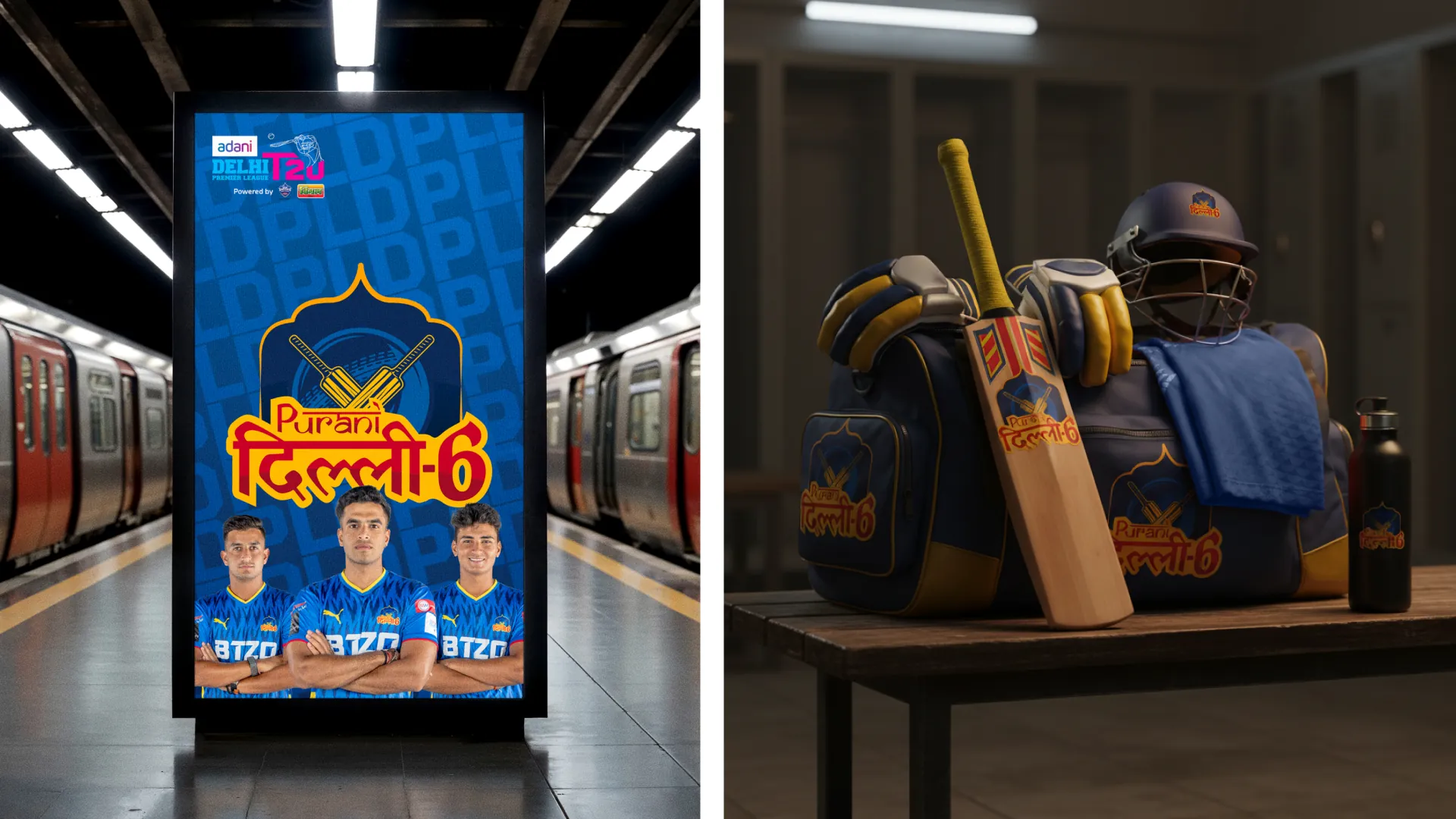
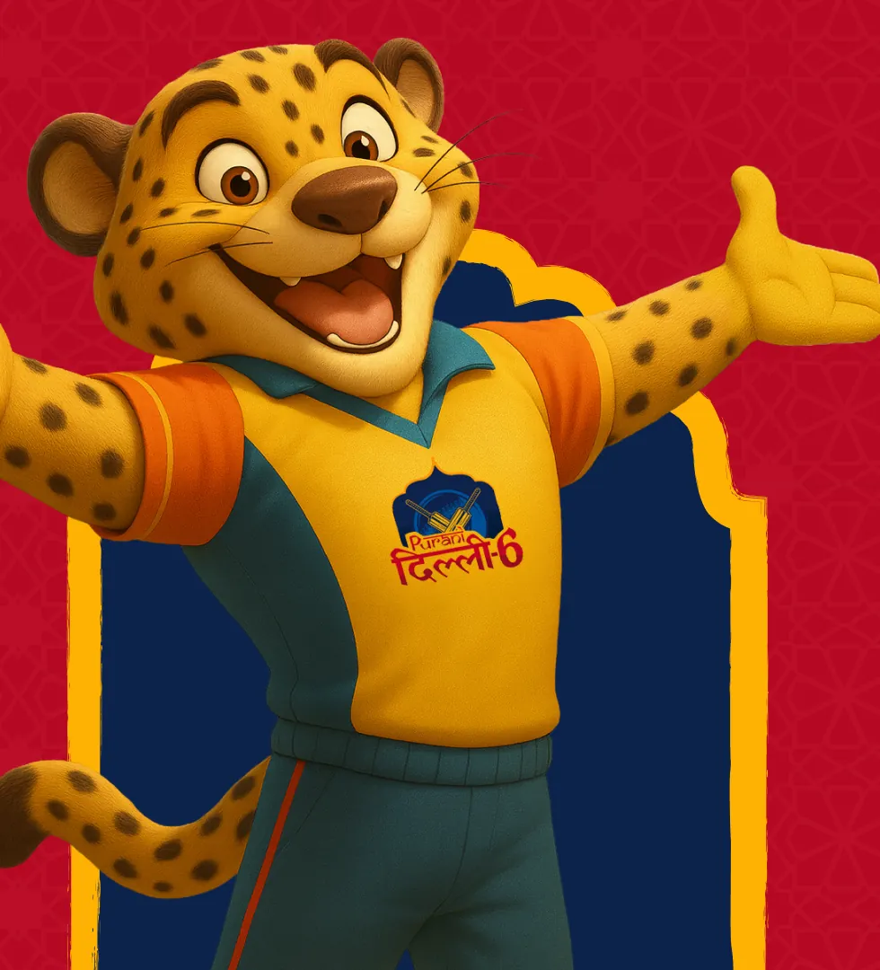
The identity was built as a complete system, with style guides to keep every touchpoint consistent. A key part of its modern presence is an AI-generated mascot that gives the team a playful, engaging character for fans online.
The final identity
The result fuses old and new: strong, confident and steeped in a legacy of greatness. It gives the team a powerful, memorable identity that resonates with fans and commands respect from opponents.