Overview
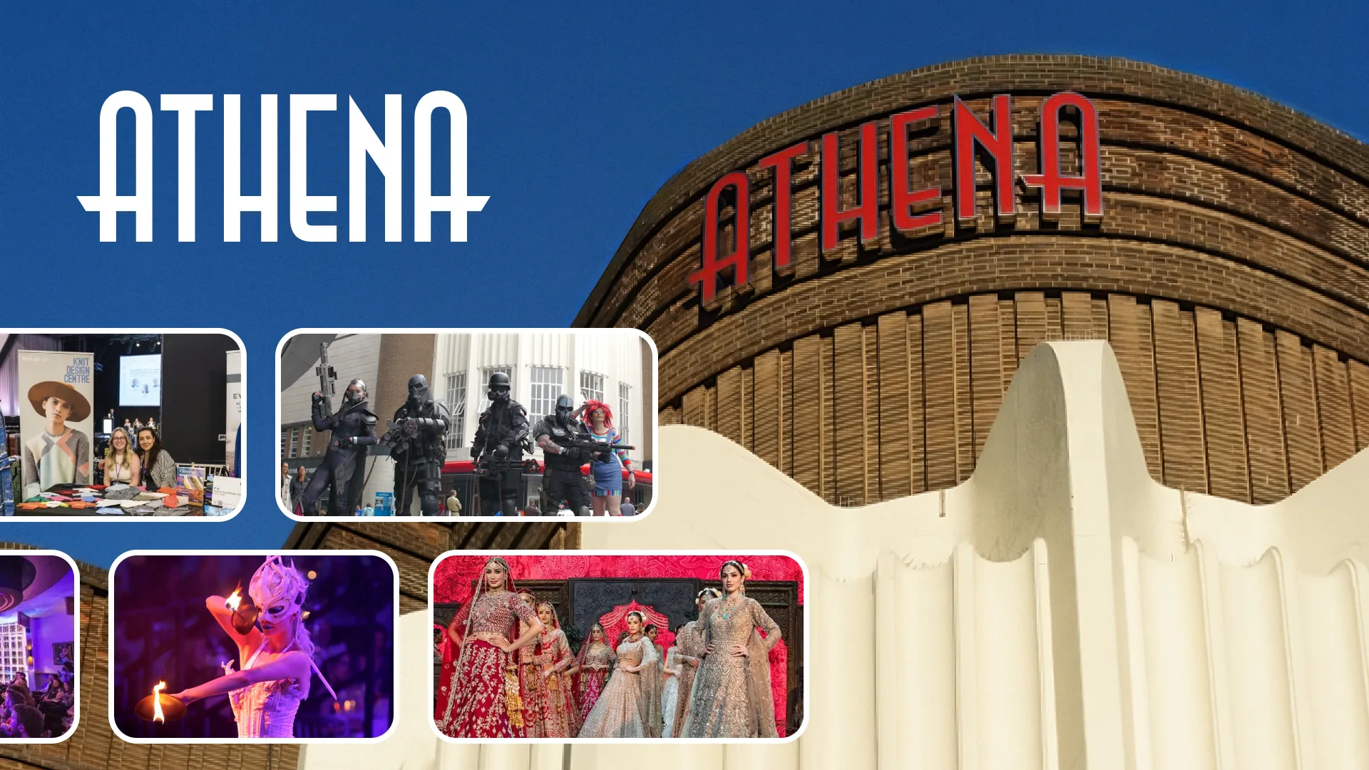
Athena is one of the UK’s most distinctive venues, a Grade II listed Art Deco building in the heart of Leicester. Its website failed to capture the elegance and prestige of the physical space. I led a complete redesign and rebuild of Athena’s digital presence, turning a dated, informational page into a modern, immersive, premium brand experience.
- Responsibilities
Research to build
Client consultation, UX research, information architecture, high-fidelity design and prototyping.
- Scope
Brand and website
A new brand identity and a full overhaul of the website.
The problem
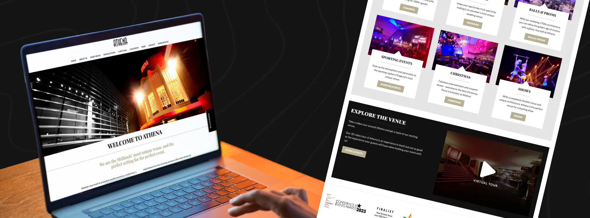
The old website was badly outdated, unresponsive on mobile and cluttered with information. It worked like a simple brochure, failing to communicate the venue’s grandeur or offer an engaging experience. That disconnect was undermining the brand and likely costing Athena valuable, high-end clients.
 Before
The vision
The client wanted their online brand to match the prestige of the venue. They didn’t just want a new website. They wanted a digital experience that gives potential customers a real feel for the venue’s atmosphere before they ever step through the doors.
 Wireframes
Design decisions
The strategy was an immersive narrative that makes people feel they’re already at Athena.
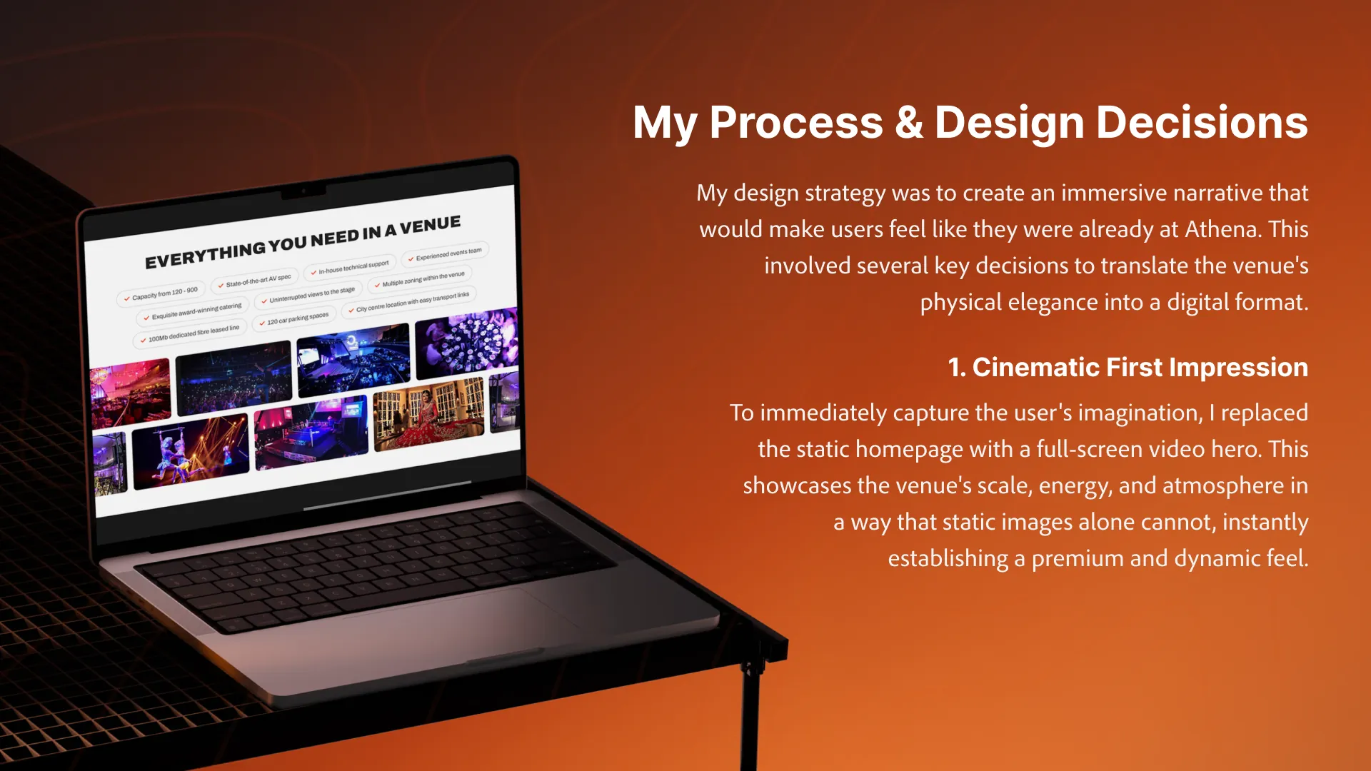
1. A cinematic first impression
I replaced the static homepage with a full-screen video hero. It shows the venue’s scale, energy and atmosphere in a way still images can’t, and sets a premium, dynamic tone straight away.
2. Storytelling through immersive visuals
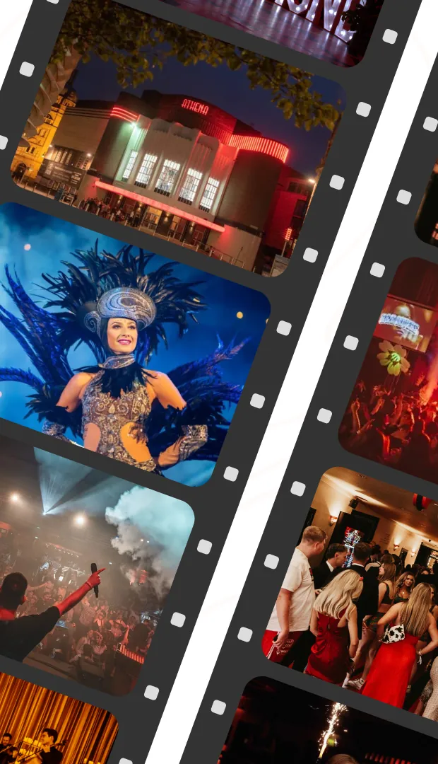
The design is built around large, high-fidelity photography, so the venue’s Art Deco details take centre stage and the space tells its own story. The “Explore our spaces” section works as an interactive journey, not just a gallery.
3. A sense of modern elegance
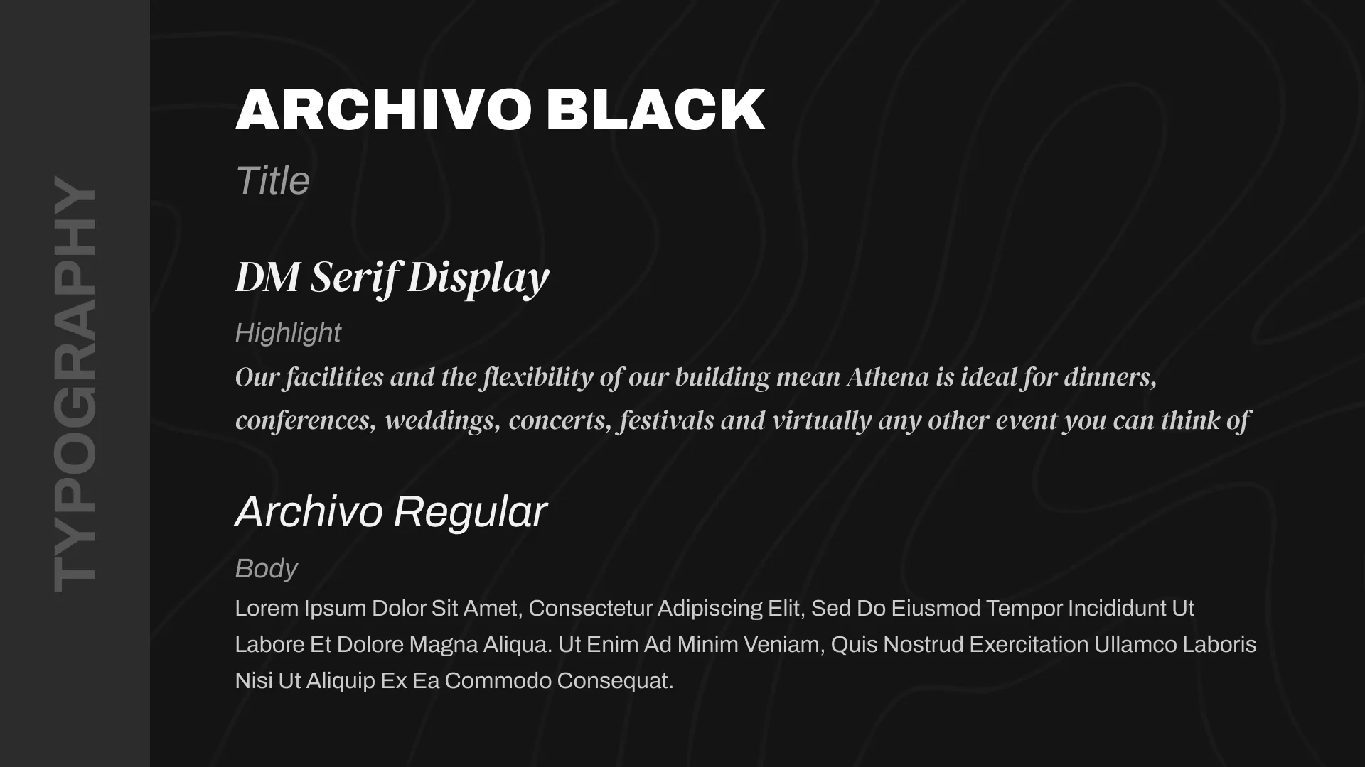
Subtle, graceful animations and transitions mirror the venue’s atmosphere: content fades in as you scroll for a polished, seamless experience. The typography is modern yet reminiscent of classic Art Deco, reinforcing the brand.
4. A clear, focused journey
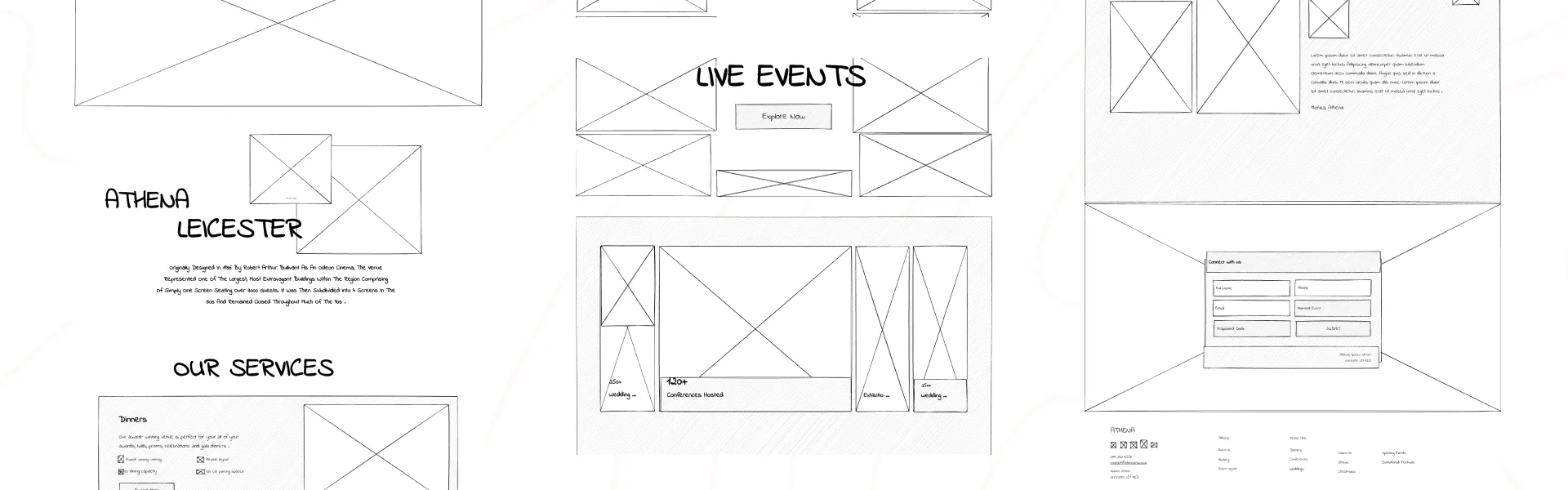
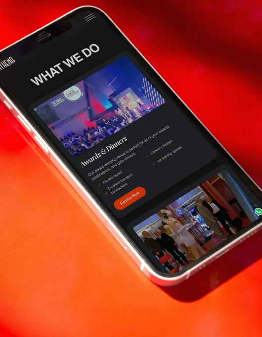
The cluttered navigation became a clean, simple structure. It guides people from exploring the spaces to event details and, most importantly, to making an enquiry, with clear calls to action at the moments that drive conversions.
Outcome
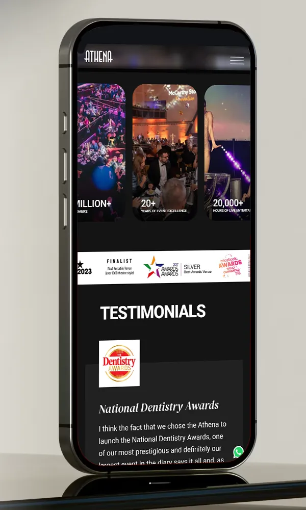
The result is a fully responsive website that works as a true digital extension of the Athena brand. It captures the venue’s character, feels both elegant and easy to use, and positions Athena as the premier destination it is.
- Result
More booking enquiries
The client reported a significant increase in booking enquiries coming through the new website.
- Result
Higher-quality leads
The premium feel attracted more serious, higher-budget clients, because people now understood the venue’s value.