Overview
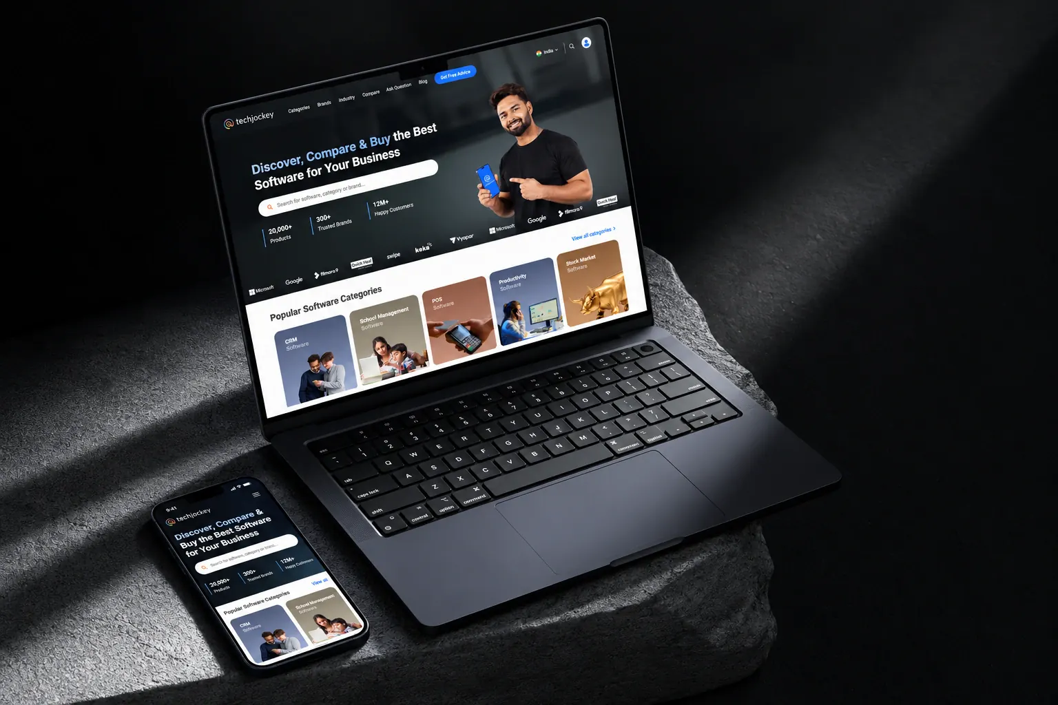
Techjockey is a B2B software marketplace that helps businesses in India discover, compare and buy software. It lists more than 20,000 products across hundreds of categories, with free demos, expert consultation and verified reviews to help buyers choose.
I spent almost four years there as a UI UX and Product Designer. Over that time the company grew from one marketplace into a family of products, each speaking to a different buyer: small businesses shopping by category, hotels looking for hospitality software, and enterprises procuring IT infrastructure with an expert at their side. My work followed that growth, from the marketplace revamp to the vertical platforms, the landing pages and marketing that brought people in, and the tools and system behind it all.
- +12%More B2B leadsAfter the marketplace revamp
- 20,000+Software productsListed on the marketplace
- 4 yrsOn the productFeb 2022 to Dec 2025
What I worked on
- Marketplace
Product UI/UX revamp
A redesign of how people browse, compare and enquire about software, which lifted B2B leads by 12%.
- Vertical
Techjockey for Hotels
A dedicated platform helping hotels find property management, channel management and booking software.
- Vertical
Techjockey Enterprise
Assisted discovery and procurement of cybersecurity, cloud, network and infrastructure solutions for large companies.
- Growth
Landing pages and marketing
Campaign landing pages and marketing material that brought buyers into the marketplace and the new verticals.
- Internal product
CRM for web and mobile
A CRM that helps teams follow up on software enquiries, on desktop and in the field.
- Foundations
Design system and motion
The internal design system used across the product, plus interactive motion graphics to guide people.
The challenge
Buying business software is a considered decision. People compare options, read reviews, book demos and often talk to an expert before they buy. The business depends on that journey ending in an enquiry, so every page has two jobs: help the buyer decide, and make it easy to ask for a demo or advice when they’re ready.
Over four years the audience also widened. A small retailer looking for billing software, a hotel group choosing a property management system and an enterprise IT team buying security infrastructure all need different things from the same brand. The design had to hold together across all of them.
1. The marketplace revamp
The category listing page is where most buying journeys start, and where the revamp did its heaviest lifting. Drag across the comparison to see the same page before and after.
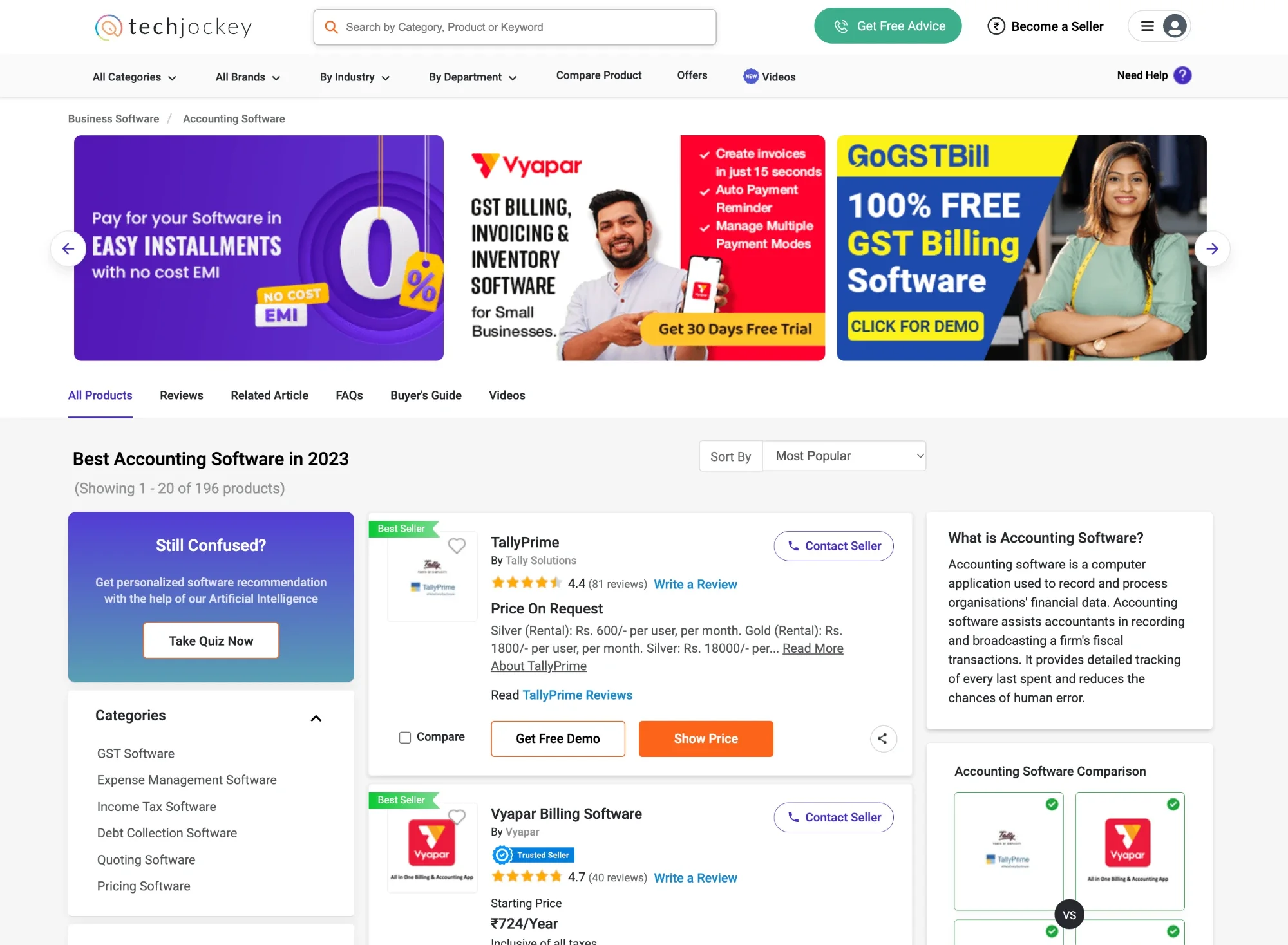
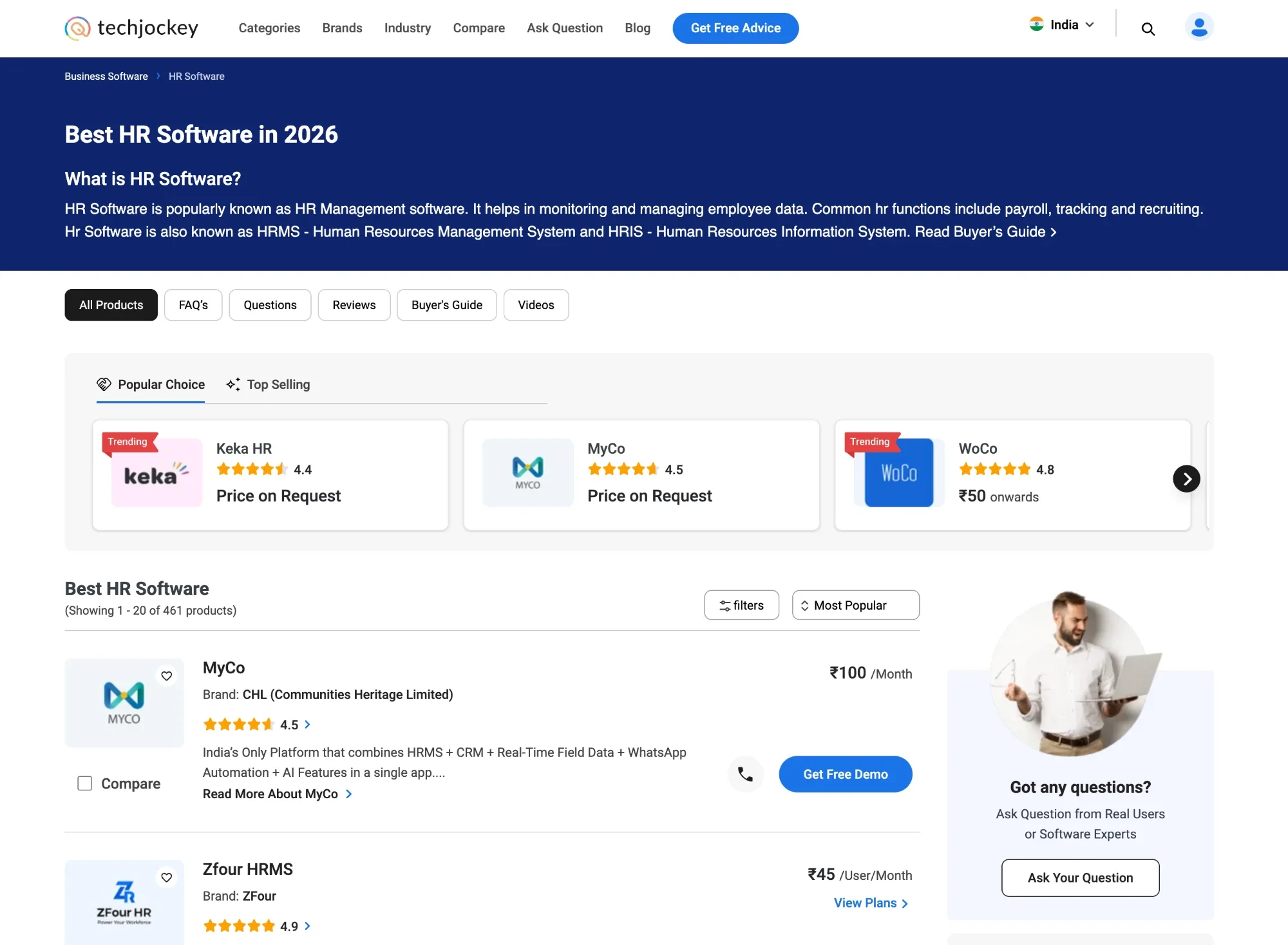
The old page asked a lot of the buyer before it helped them. A two-row header competed with a carousel of paid banners, and every product card carried up to five actions. The revamp reordered the page around the decision the buyer is trying to make.
- Navigation
One calm header
Two rows of navigation, search and seller links became a single row with one primary action, “Get Free Advice”. Search moved to an icon, so the page content starts higher.
- Orientation
Explain the category first
The banner carousel at the top gave way to a short introduction: what this kind of software is, with a link to the buyer’s guide. A first-time buyer now learns what they’re shopping for before they see a single product.
- Decision
A shortlist before the long list
A “Popular choice” and “Top selling” strip puts a handful of well-rated products, with ratings and prices, ahead of hundreds of results.
- Action
One clear next step per product
Product rows lead with the name, brand, rating, a one-line pitch and the price, then a single primary “Get Free Demo” button with a call option beside it. Compare stays, as a checkbox.
- Layout
Two columns instead of three
The left rail of filters and quiz prompts and the right rail of definitions folded into a filter button and one help card, “Got any questions?”, so the list gets the room.
- Wayfinding
Everything about a category, one tap away
All products, FAQs, questions, reviews, the buyer’s guide and videos sit as tabs under the header, so research and comparison happen without leaving the page.
2. Techjockey for Hotels
Hospitality runs on a specific stack: property management, channel managers, booking engines, revenue management and the network that holds it together. Hotels were also wary buyers. The page opens with research findings that make the case plainly, like 85% of hoteliers having lived through a failed technology implementation.
Techjockey for Hotels gave this audience its own front door, with a brand lockup, navigation and content made for hoteliers rather than the general marketplace.
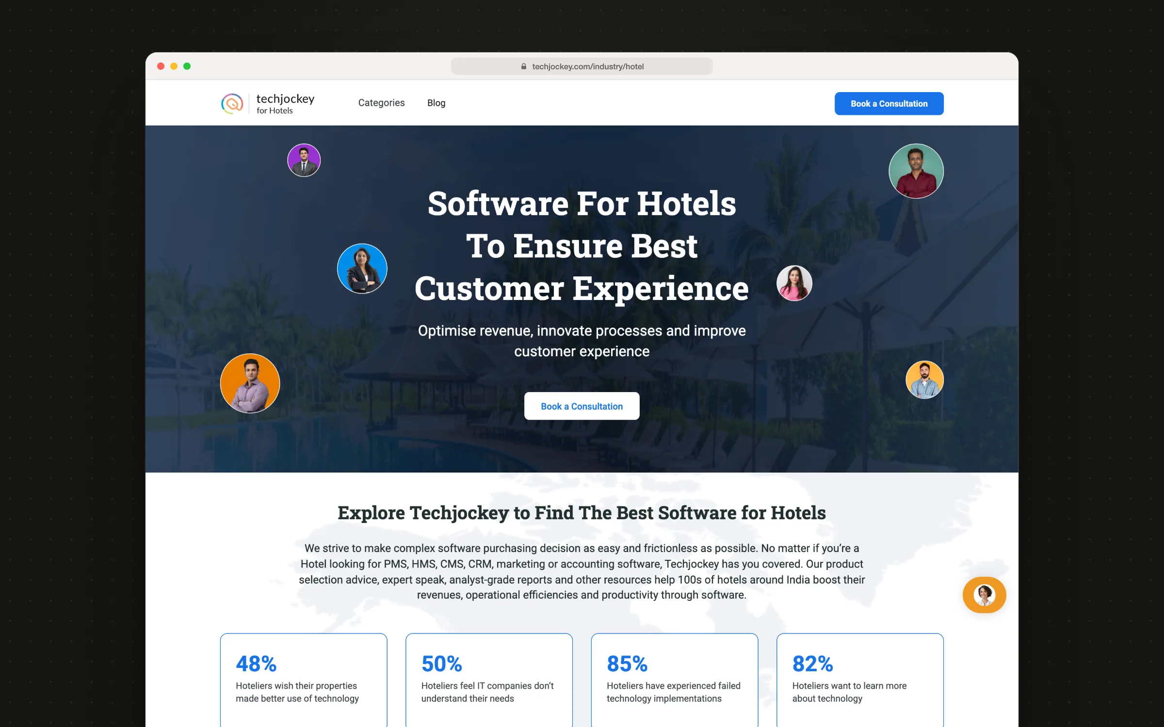
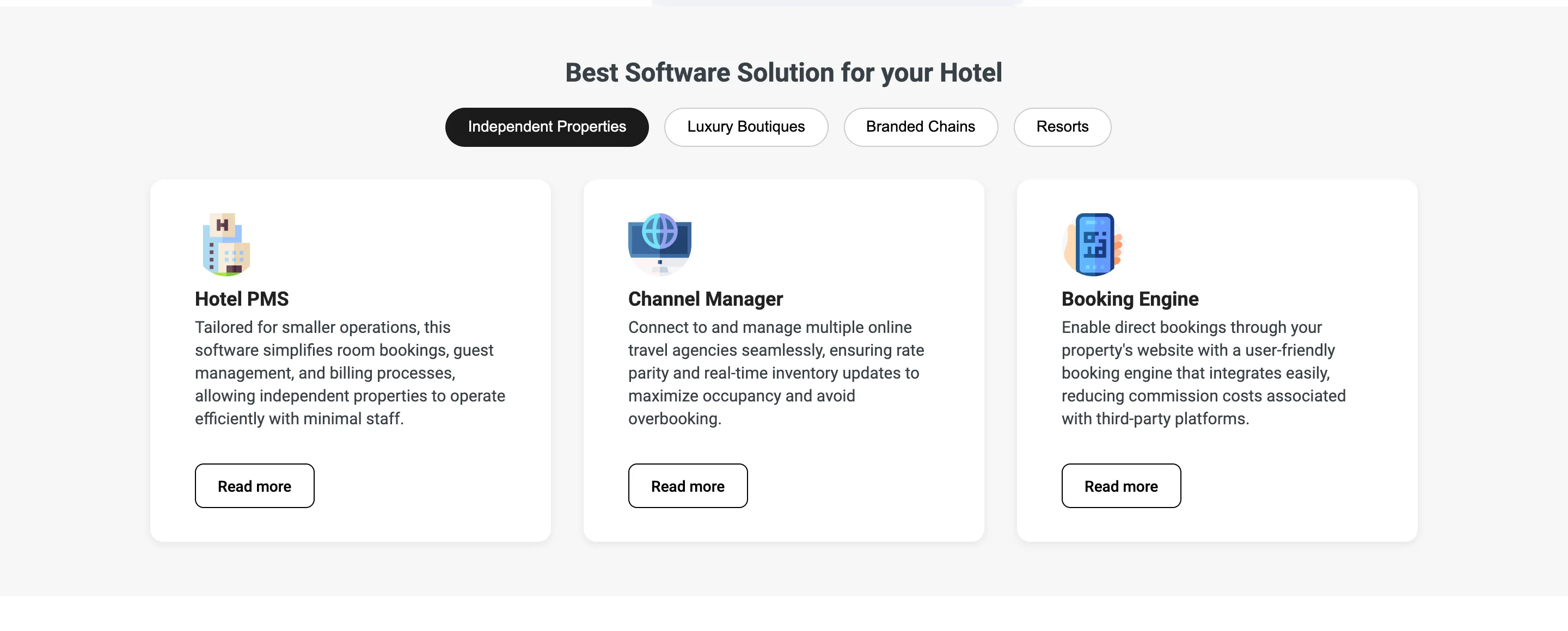
A hotel’s needs depend on what kind of property it is, so recommendations are organised by property type: independent properties, luxury boutiques, branded chains and resorts. Each tab surfaces the categories that matter most for that kind of hotel, explained in hotelier language. One action carries through the page, “Book a consultation”, because for most hotels the right first step is a conversation, not a cart.
3. Techjockey Enterprise
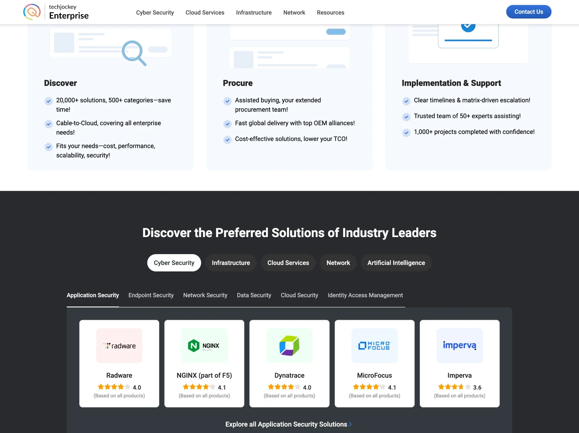
Enterprise buying works differently. A cybersecurity suite or a cloud migration isn’t added to a cart: it’s assessed, negotiated, implemented and supported, often with several vendors involved. Techjockey Enterprise positions the company as an extended procurement team, guiding companies from discovery through procurement to implementation and support.
The design shifts register to match. It’s darker and more restrained than the marketplace, with client logos and proof up front. The navigation is organised around solution areas (cybersecurity, cloud services, infrastructure and network) instead of software categories. A solution explorer lets IT teams move from a domain to a sub-domain to the leading vendors in a few clicks. Instead of “buy now”, the page ends in a short consultation form that asks for designation and company size, so the right expert can pick up the conversation.
4. Landing pages and marketing
Alongside the product, I designed landing pages and marketing material for campaigns and launches, including the pages that introduced the new verticals. These pages work to a tighter brief than the product: one audience, one offer and one action. Building them from the same components as the product kept them recognisably Techjockey.
5. The CRM
Every enquiry from the marketplace needs a quick, well-timed follow-up. I designed an in-house CRM around the next action on each lead, on web for the team at their desks and on mobile for people working away from one.
6. The design system
I built and maintained the internal design system: tokens, components and their states, documented for engineering. It gave the marketplace, two vertical platforms, an internal CRM and a steady stream of campaign pages one shared foundation, so none of them drifted into a look of its own.
Outcome
- Result
+12% B2B leads
The marketplace revamp turned more browsing into demo requests and expert consultations.
- Reach
Two new verticals
Hotels and Enterprise each got a platform built around how that audience actually buys.
- Consistency
One design language
A shared system kept the marketplace, the verticals, the CRM and campaigns recognisably one brand.